After doing a bunch of AI-assisted portraits of fictional characters for my creative writing endeavors, as well as having done a whole bunch of photorealistic bird sketches for my Deck of Birds, I thought I might finally be ready to try drawing portraits of humans. This is something I wasn’t interested in for a long time because (a) humans have built-in face recognition hardware that’s very, very good at noticing when something is even slightly off about a face, which means drawing recognizable portraits demands a higher degree of accuracy than drawing other things, and (b) I didn’t like humans very much. Writing a novel has made me more interested in other people, probably because writing fiction is a protracted exercise in empathy. I found myself noticing the diversity of faces around me more, and liking how they looked.
I also wanted to make this a bit of an uncontrolled experiment, sort of like “Super Size Me”–I’d do as many as I could in the span of two weeks and see how much I could improve in that window. The original goal was to do one a day; I ended up missing only two days and getting twelve done in total, which I’m pretty happy with.
Method
I do all my drawing in Procreate with an Apple Pencil. I decided to do everything in plain black and white, cross-hatching style, because I felt that it was the most stripped down and basic, and should make problems with my fundamentals clear. After chooisng a photo reference from the internet, first I’d do a really rough sketch in yellow, which often looked like a drunk thirteen-year-old had done it. (The wonkiness of proportions on the first pass is exacerbated by the fact that usually when you’re drawing digitally, you’re zoomed in so much that most of the drawing is offscreen, so you can’t see where the thing you’re working on is relative to everything else.) Then I’d zoom out and use the lasso selection tool to move, distort, and resize features until the proportions were slightly better; then I’d do a better sketch in red, do more lassoing, and do the final sketch in black. (The reason the final one can’t have been lassoed is because every time you distort or resize, it loses resolution.) Thank goodness for digital drawing–with physical drawing, every time you move something you have to redraw it from scratch!
As I improved, I was able to refine the yellow sketch more before proceeding, and then my red sketch became the final, which is why the later portraits appear gray–I just applied a filter to the red. That was one goal I set that I accomplished–being able to get a similar result in two sketches instead of three. Finally, I would grade my work by underlaying the photo behind the sketch and seeing how close I was. If the differences were egregious, I’d attempt to correct it, though I exported before proceeding to keep the evidence.
I often mirrored the canvas, a trick that makes asymmetries stick out, but the videos below omit that. Mirroring was an invaluable tool in the first few, but as I improved and branched out to people not facing straight on, it became less important.
Here’s a time-lapse video of the last sketch I did, of Jane Lynch:
This one didn’t really need any corrections–the proportions were fairly close. Her jawline is a little too low by the ear, and her shoulders are too narrow, but it’s not that noticeable.
Here’s a time-lapse of one of the middle sketches I did, of Steph Curry:
This one went through a lot of stretching and twisting before I figured out the proportions. His hair and forehead being mostly featureless made it harder, since I didn’t have any reference points.
And here’s a time-lapse of the second sketch I did, of Brad Pitt:
You can see how rough the yellow sketch is compared to the Jane Lynch one. Even the red Brad Pitt sketch is rougher than the Jane Lynch yellow sketch.
Lessons Learned
Here are the sketches I did, in order. Whenever there is a comparison of two side by side, the left is my original attempt and the right is the version I corrected by putting the photo underneath.
1. Amy Adams
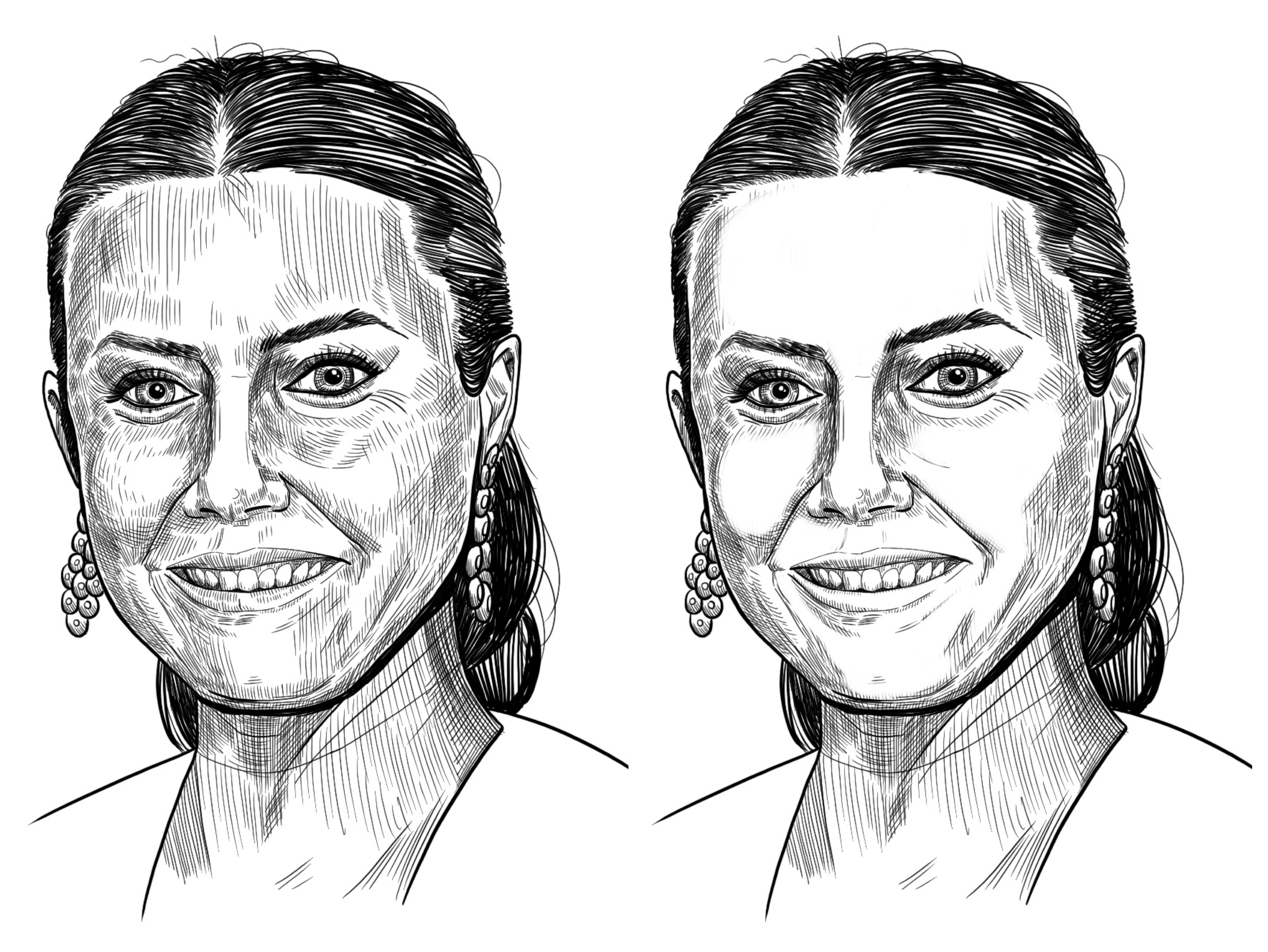
I actually got the proportions basically spot-on on my first attempt, but I went so overboard on the hatching that she looks like leather. I went to Reddit for help, and someone helped me erase a lot of the extraneous hatching, producing the image on the right.
Lessons learned:
- Don’t hatch too much; the difference between light and medium-light areas can be mostly ignored and just represented as white space for both.
- Bold lines don’t cover up mistakes or areas of uncertainty. They just make it look cartoonish.
- Long, unbroken hatches are not recommended, as they contribute to the ghoul-skin texture.
- Don’t draw individual teeth. The division between teeth is such a light tone that it doesn’t merit a full black line.
2. Brad Pitt
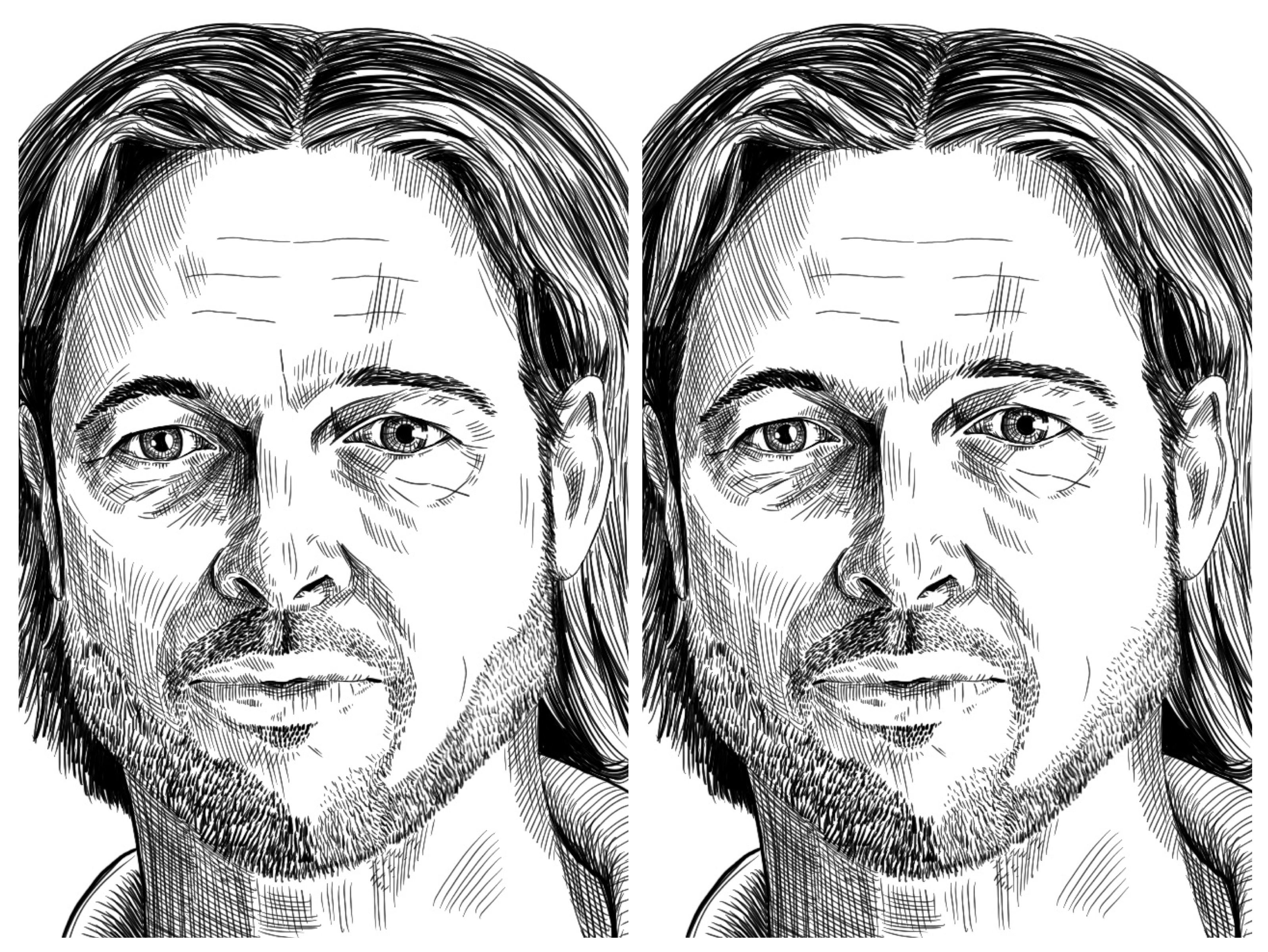
I was happy with how the nose and mouth turned out here, and the texture of the beard. Unfortunately, his hair looks like a solid mass, and his eyes are way out of place, especially his left (our right). After moving the eyes, it looks much more Brad Pitt-y. I was struck by how delicate and un-manly his eyebrows are, not something I would have noticed from just looking at a photo.
Lessons learned:
- The beard needs to be shaded too–in the left image it looks too dark and abrupt on the viewer’s right side and too light/gray on the viewer’s left, because the color is uniform on the shaded and lighted sides of the face. In the corrected image on the right, I made the right side fade in more gradually.
- Think more about eye position before proceeding to the next sketch.
- Refine the hair more before proceeding to the next sketch.
3. Maya Rudolph
Maya Rudolph has a more distinctive face than Brad Pitt or Amy Adams, so it was easier to make it recognizable as her. The proportions were also not too far off, though her mouth looks more puckered in mine than in the original.
Lessons learned:
- While it doesn’t look bad, it doesn’t look very artistic. The darks aren’t dark enough and there’s still generally too much hatching.
- Try to avoid actual cross hatching as much as possible; use a single-direction hatch when you can. Crosses make the texture look like cloth.
4. Keanu Reeves
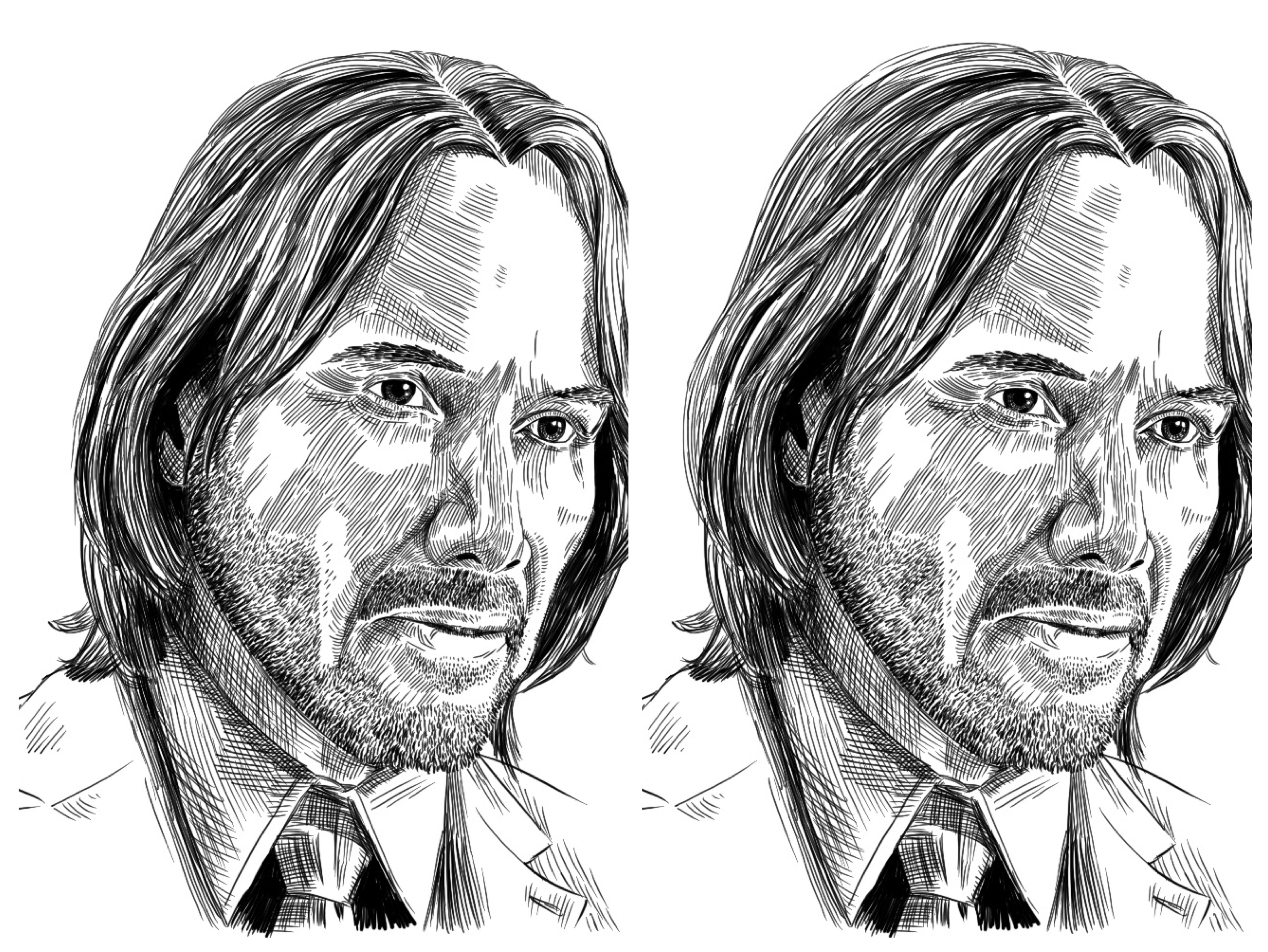
Keanu also has a very distinctive face. As I was working on this, I just kept elongating his face over and over, because it was still too short. This was also my first attempt at someone not looking straight at the camera, so the mirror tool was much less helpful. I wasn’t happy with how much the white patches on the shaded side of his face stick out visually, but I didn’t know how to fix it. I tried sparser hatching but it looked like clown makeup, and I couldn’t do thinner hatches because the existing ones were already one pixel wide.
Lessons learned:
- Pay attention to the angle of the line going between the eyes. In my original attempt, it’s like fifteen degrees more tilted than actual.
- I could have fixed the white patches by going over the hatching on the shade side with a thicker stroke, and then using thin hatches for the lighter parts, but I didn’t want to put in that effort for this. Next!
- I’m often making the head too small; that was the case for Maya Rudolph too. Be aware of this.
5. Kamala Harris
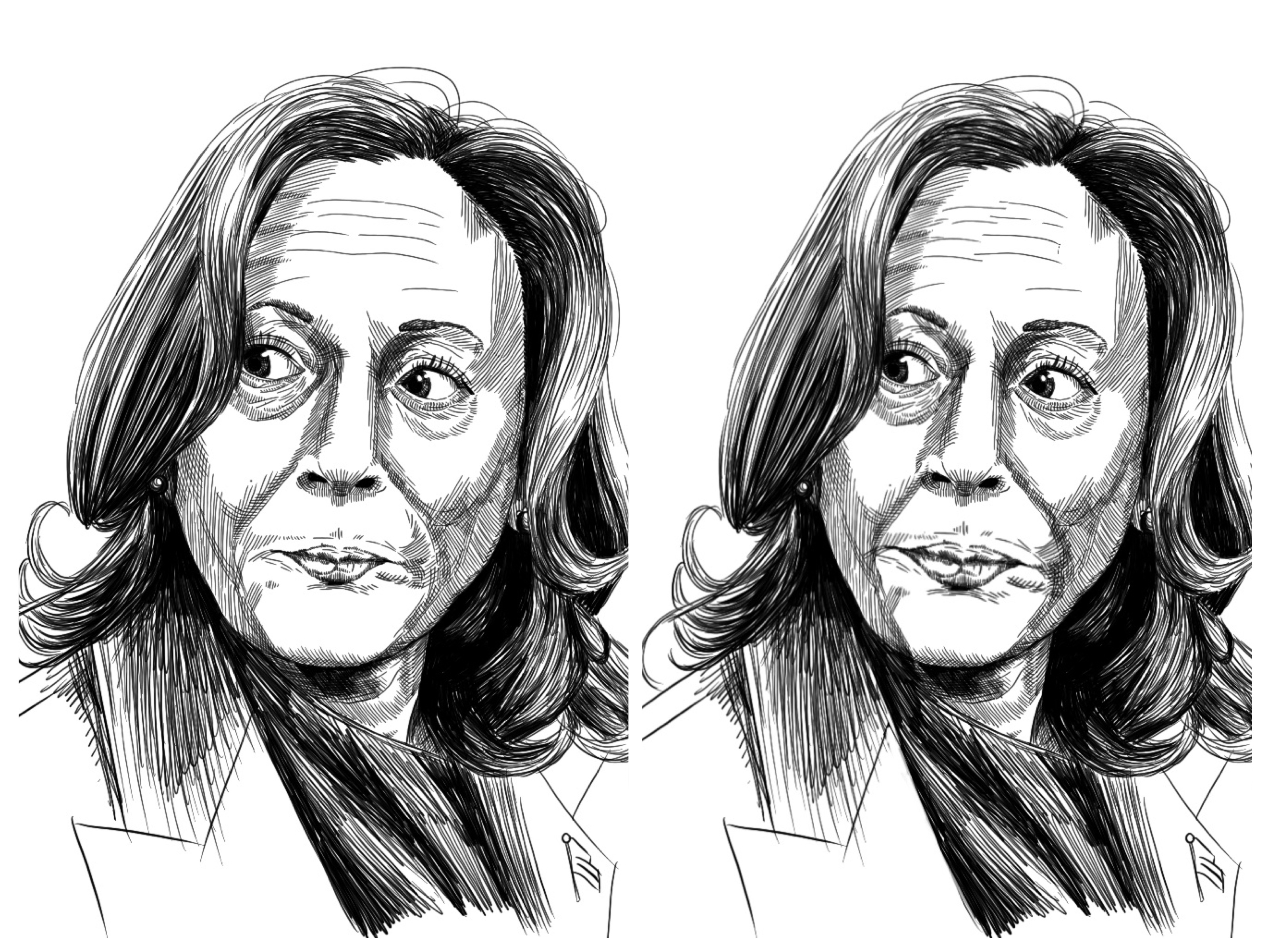
I’d thought I was getting better at proportions… and wow was I way off with this one. Her face was like fifty percent too wide, and her mouth a hundred percent too small. Furthermore, the leathery look is starting to creep back in… my friend described this as “flashlight under the face vibes”.
Lessons learned:
- Like Keanu, Kamala has a very long, narrow face (what my brother calls “a Luigi head”). I wasn’t brave enough to make it as extreme as it really should have been. There’s significant variation in the shapes of people’s faces–contrast this aspect ratio with Maya Rudolph, who definitely has a Mario head.
- Don’t get lazy on the shaded parts and just do long hatches one way. There’s still different darkness values to be expressed in those areas.
6. Steph Curry
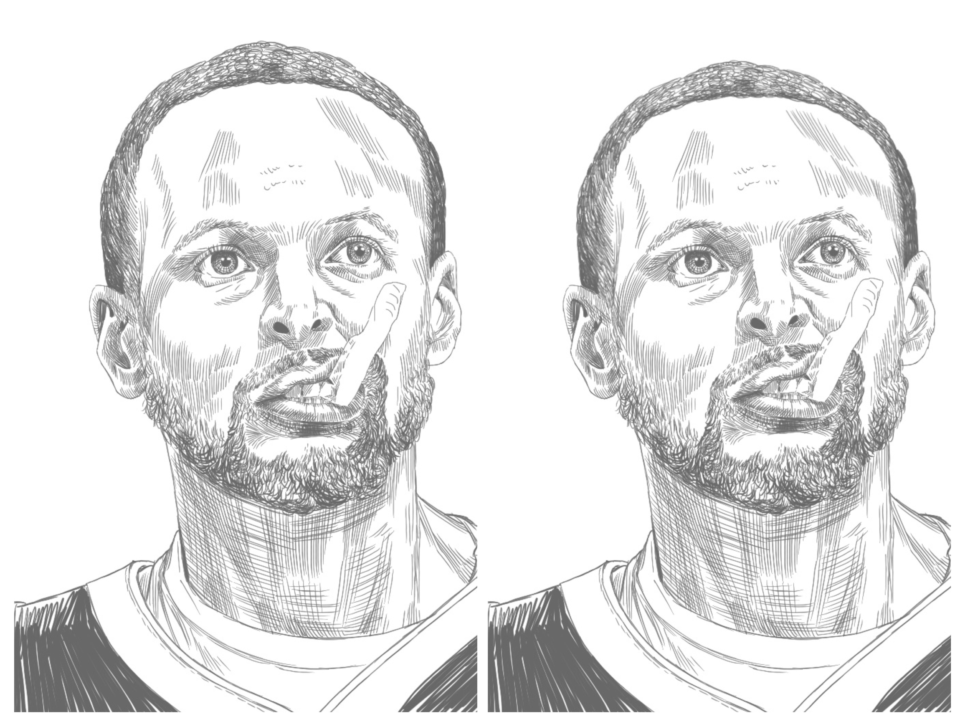
To continue the trend of the last four portraits of ethnically mixed subjects, here’s Steph Curry thinking about a free throw. The fact that his head is tilted back really confused me–I didn’t sufficiently foreshorten his forehead, and I had his nose and mouth too centered when they should have been more off to the right. I was very happy with how the teeth came out though. A huge step up from Amy Adams’s fangs!
Lessons learned:
- Notice the 3D positioning of the head, not just in yaw and bank but also in pitch. Use the distances from features to the sides of the face as reference.
- Foreshortening is hard!
7. Pedro Pascal
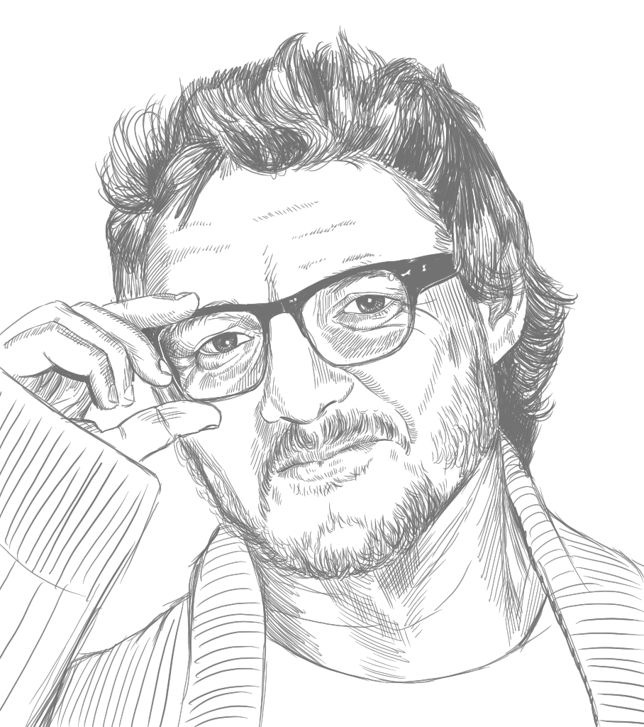
I wanted to try drawing someone with glasses. Turns out, they really help set the proportions by breaking up the face into quadrants. As a result, the proportions on this one were very close. However, it ended up looking kind of simplistic compared to the Steph Curry portrait, I think because the darks aren’t dark enough again, making it look flat. I think Pedro Pascal just has a flatter face than Steph Curry though, so maybe it’s not entirely my fault.
Lessons learned:
- I guess beards are trendy right now. How did I not notice this before?
- I need a better method for hair. It looks like he has a bad case of bed head.
8. Louis CK
I wanted to try drawing an overweight person. Unfortunately for poor Louis, I made him look even fatter than he really is… Other than the neck/chin area though, the proportions were quite close, so I didn’t bother correcting it.
Lessons learned:
- This expression was quite difficult to get right (and I don’t think I quite did it justice in the end). He’s looking up from under his eyebrows without raising them, and that made him look very menacing until I’d done a lot of tweaking. In the reference photo he still looks somewhat more inquisitive and less threatening than this.
- I’m always miles off on the shoulder and neck positioning, but so far it hasn’t mattered.
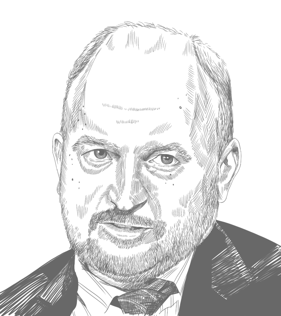
9. Alex Karp
Enough with the beards already–isn’t there a male celebrity without one? This photo of Karp both fulfilled that condition and includes rimless glasses, which I hadn’t done before. The tricky part is suggesting a border without actually drawing it, or by leaving an area white amongst other shading.
Lessons learned:
- Okay, being miles off on the neck finally bit me. Somehow I failed to notice that my original attempt looked like he’d been doing Atlas strongman neck exercises. His neck was like two inches too wide.
- I think I’ve gotten better at making the dark areas dark enough by this one. The shade side of the face, neck, and hair stand out more deeply than in previous portraits.
- Other than the neck, the proportions were good. I think I’ve gotten better at that too.
10. Robert Downey Junior
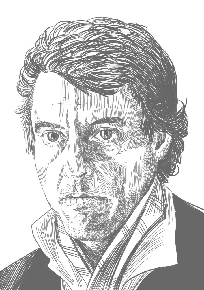
Here’s another clean-ish shaven guy, RDJ from Sherlock. I was working from a much lower-res photo than usual, and I think it had some effect. His eyes ended up less detailed than in other portraits.
Lessons learned:
- Somehow, even though the proportions are basically spot-on, it doesn’t really look like the subject. There’s some ineffable Robert Downey Junior-ness that’s missing. Is it because he has a generic face? Even after completing all my portraits I still don’t know the answer to this.
- The shading on the shaded side is kind of patchy, making him look like a quilt. I need more gradual transitions between the hatching sections.
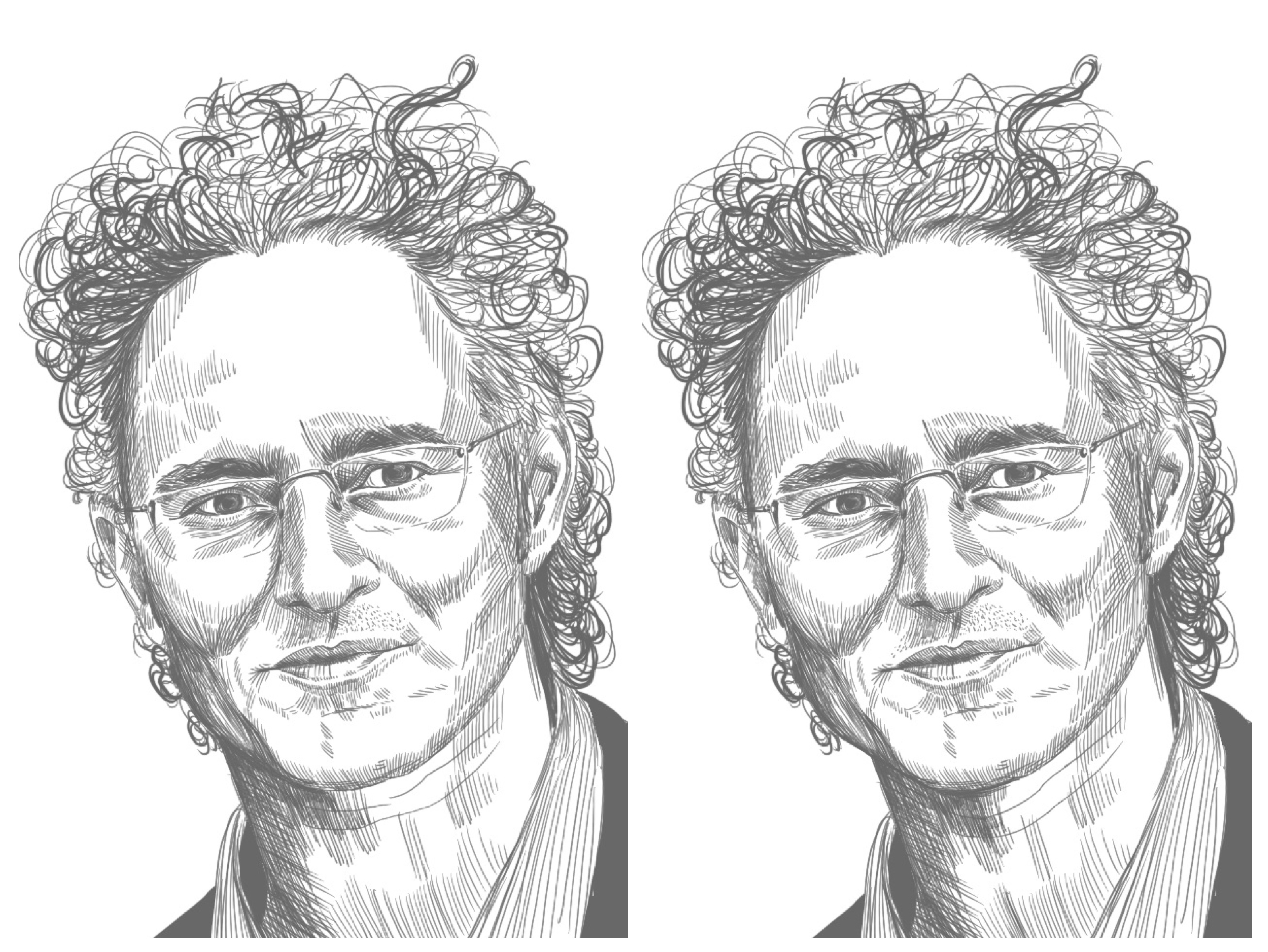
11. Taylor Swift
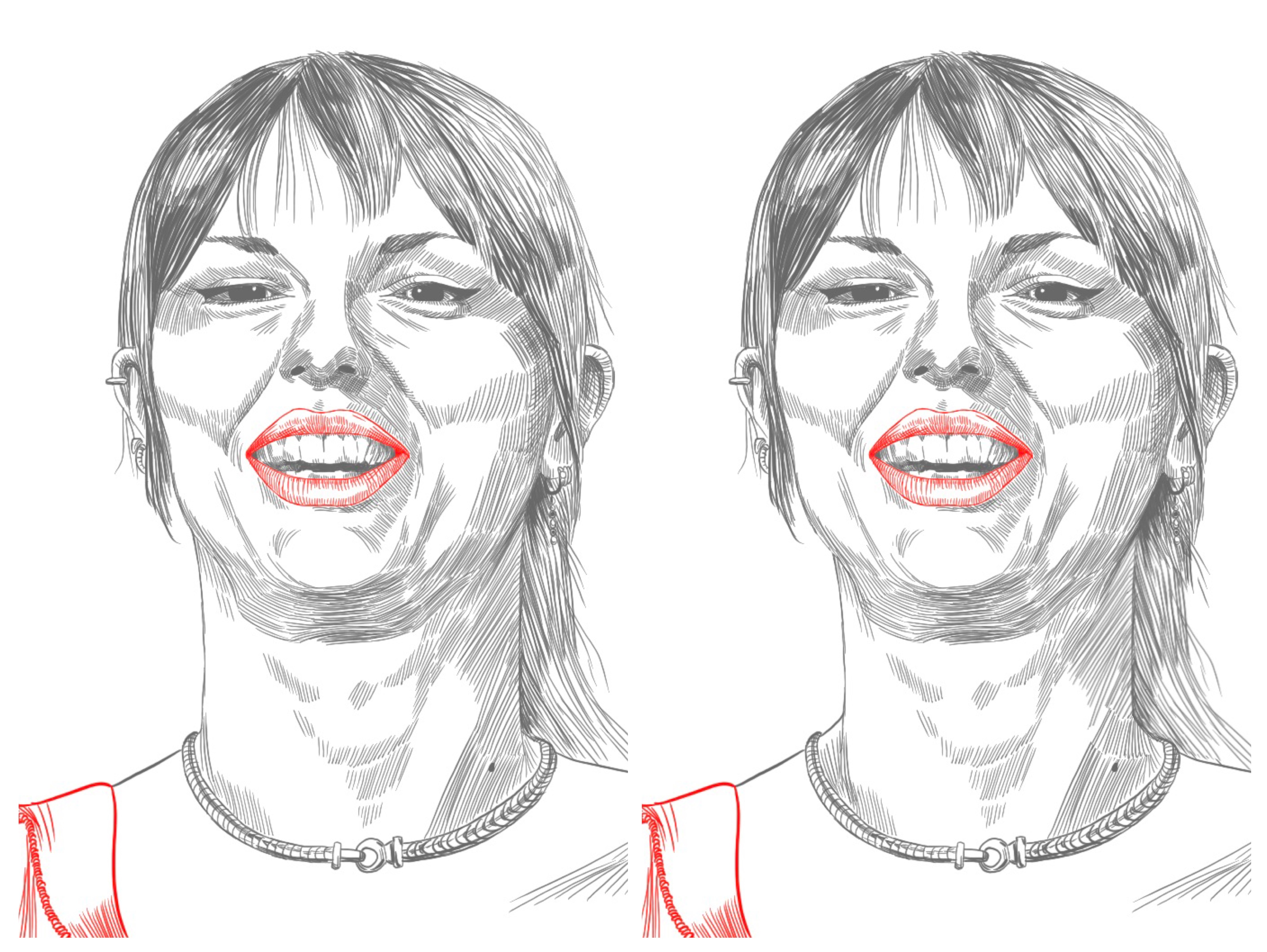
With this one, her head is tilted back and foreshortened even more than Steph Curry’s was, and she doesn’t have a beard to cover the face/neck transition area (which normal people refer to as a throat). I tried something new with leaving some parts red, and I’m not sure I like it.
Lessons learned:
- I made the same mistake again! Her neck is a mile wider than it should be! That’s the only correction between left and right. Fool me twice…
- I took the “try to single hatch” advice too far in the other direction. Her nose looks like abstract art. Cross-hatching is acceptable in areas of darker shadow, or in small cramped areas with surfaces pointing in lots of directions. A nose is both of those things.
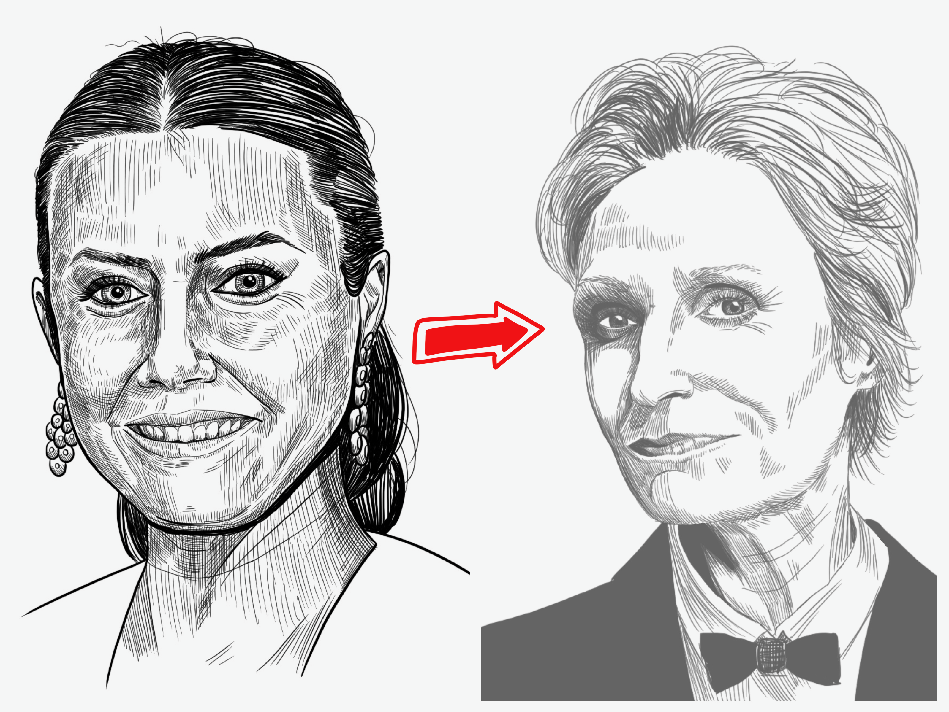
12. Jane Lynch
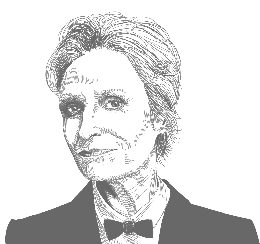
This one was an exercise in contrast. Her eyes are so deep in her skull, and her eyebrows are just suggestions of eyebrows.
After finishing this one, I was tired of drawing. I’ll keep doing portraits and trying to get better later on, but I think I want to take a break for now, and maybe get some more outside feedback on what I’ve already done, especially the hair. I’ve definitely improved a lot since the first ones though–I didn’t have to mirror this one at all to get things right (I did mirror it to check, but didn’t change anything based on things I noticed due to mirroring) and it came together more quickly and easily.